I Was Not Happy With a Mobile Layout – Design Considerations
When creating a design, my first priority is ease of use—for both the end user (the website visitor) and the website admin.
Key action items should be clearly highlighted, and important details given prominence with visual hierarchy.
Accessibility also needs to be built into the design wherever possible (within the constraints of the builder).
This includes considerations like contrast, responsive font sizing, consistent padding and spacing scales, keyboard navigation, and visible focus states.
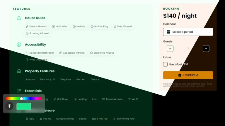
I also try to anticipate how the website admin might want to make changes in the future. For example, color management is simplified through just two inputs: choose a Base color and a Primary color.
All the shade variations are generated automatically from those base values. If the admin needs to adjust the math behind the scale, they can—although, unfortunately, there’s no visual feedback for this on the backend.
Even with all of this in mind, responsive layout behavior brings its own set of challenges—especially when it comes to layout shifts.
For the best user experience, context should remain front and center—users need to immediately understand what the webpage is about and why they should continue scrolling.
In a recent events page example, the layout used a two-column grid with “Left” and “Right” containers. (Sorry RTL users—I’m thinking of you, but calling them “row-start” and “row-end” might confuse others.)
On mobile, the design naturally collapsed into a single column. The right-hand “event dates” container was set to display first (using order: -1).
While this technically worked, an issue became apparent on smaller devices, where the event dates appeared above the title.
Depending on the number of upcoming dates—and the screen size—the title could be pushed off-screen, leaving users confused about what the dates referred to.
This broke the visual connection between the event and its details, weakening the context between the title, dates, and ticket information.
Problem: Dates or ‘Add to cart’ appear above the event title on mobile.
Is this a huge issue? Maybe not. But I wasn’t happy with it.
It’s not best practice.
Here’s the ideal outcome on mobile:
The title should appear first.
The event dates should appear second.
Other content should come third.
The solution
Show event title above dates or ‘Add to cart’ on mobile.
To achieve this, I needed to rework the layout. Instead of using just two containers (left and right), I needed three: title, dates, and content.
On larger screens, I could use grid span controls to maintain the two-column structure and allow sticky elements to span multiple rows. On mobile, the layout would collapse into a single column, and I could control the display order using grid start.
A bit more work, but doable.
Which option to choose?
The simplest approach would be to use a utility class that sets the grid start/span just for the dates container, and only applies it on mobile.
As long as I know the builder’s mobile breakpoint, this works fine.
However, the website admin might use a different breakpoint than I do.
If the breakpoint changes, the admin would have to update the utility class accordingly.
This raises a question: Should this CSS live inside the builder, or should it be included as an external file with the template?
I landed with deciphering the native Elementor grid controls. This has the benefit of always matching breakpoints, and no extra CSS files are needed.
However, these controls are not intuitive, and I believe actually bugged (labels).
With Voxel’s design flexibility, the possibilities are endless. Get Voxel here!
Conclusion
After strenuous testing (and wrestling with Elementor’s column start/span controls), I got it working.
Sweating the small stuff—like perfecting mobile layout behavior—is just one of many design decisions I carefully consider in every project.
If you value thoughtful, detail-driven design with a strong focus on usability and maintainability, let’s talk. Reach out to hire me — Let’s connect and make something exceptional.
Displaying parent categories with their child categories grouped underneath in Voxel is difficult and not directly supported by default term feed options. To achieve this, you need to use a term loop workaround that allows child terms to be looped inside a parent term preview. The steps below show how to do this using native […]
Voxel Framework is a new WordPress plugin in development that brings Voxel’s features to Bricks Builder and Gutenberg. While Voxel can create custom post types, taxonomies, and custom fields — and supports powerful dynamic data, conditional logic, and visibility rules — its real value goes far beyond content structure. Details below are speculative based on […]


