Stop Wasting Time Setting Font Sizes and Spacing on Every Breakpoint — Use Fluid Typography and Spacing
What Can Be Fluid?
Fluid design isn’t just about text — almost everything in your layout can scale smoothly with screen size. This creates a seamless experience across all devices.
The main things you can make fluid are:
Font sizes – headings, body text, labels
Spacing – padding, margins, and section spacing
Elements – widths, heights, buttons, and cards
Everything stays proportional, without abrupt jumps at breakpoints.
How It Works
You define a minimum and maximum size for your text and spacing.
The browser automatically calculates the right size based on the viewport width. You don’t need to think about mobile, tablet, or desktop separately — the scaling happens naturally in between.
CSS variables store these values once, so the same rules are reused everywhere. Headings, body text, and spacing all stay in sync.
The main tool behind fluid sizing is the CSS clamp() function, which lets you define a minimum value and a maximum value within a set viewport width. This allows your typography and spacing to grow or shrink naturally without abrupt jumps at breakpoints.
The Small Learning Curve
There is a small learning curve, but it’s very manageable:
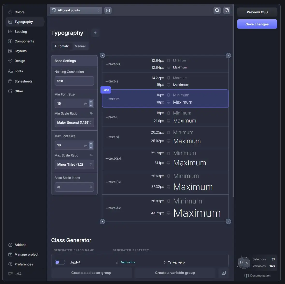
First, you define your CSS variables using a tool like Core Framework or an online tool like Fluid Type Scale Calculator. These variables cover your font sizes, spacing, and other scalable properties. Common naming conventions include:
Font size variables:
--text-xs, --text-s, --text-m, --text-l, --text-xl, and so on
Spacing variables:
--space-xs, --space-s, --space-m, --space-l, --space-xl, --space-2xl, etc.
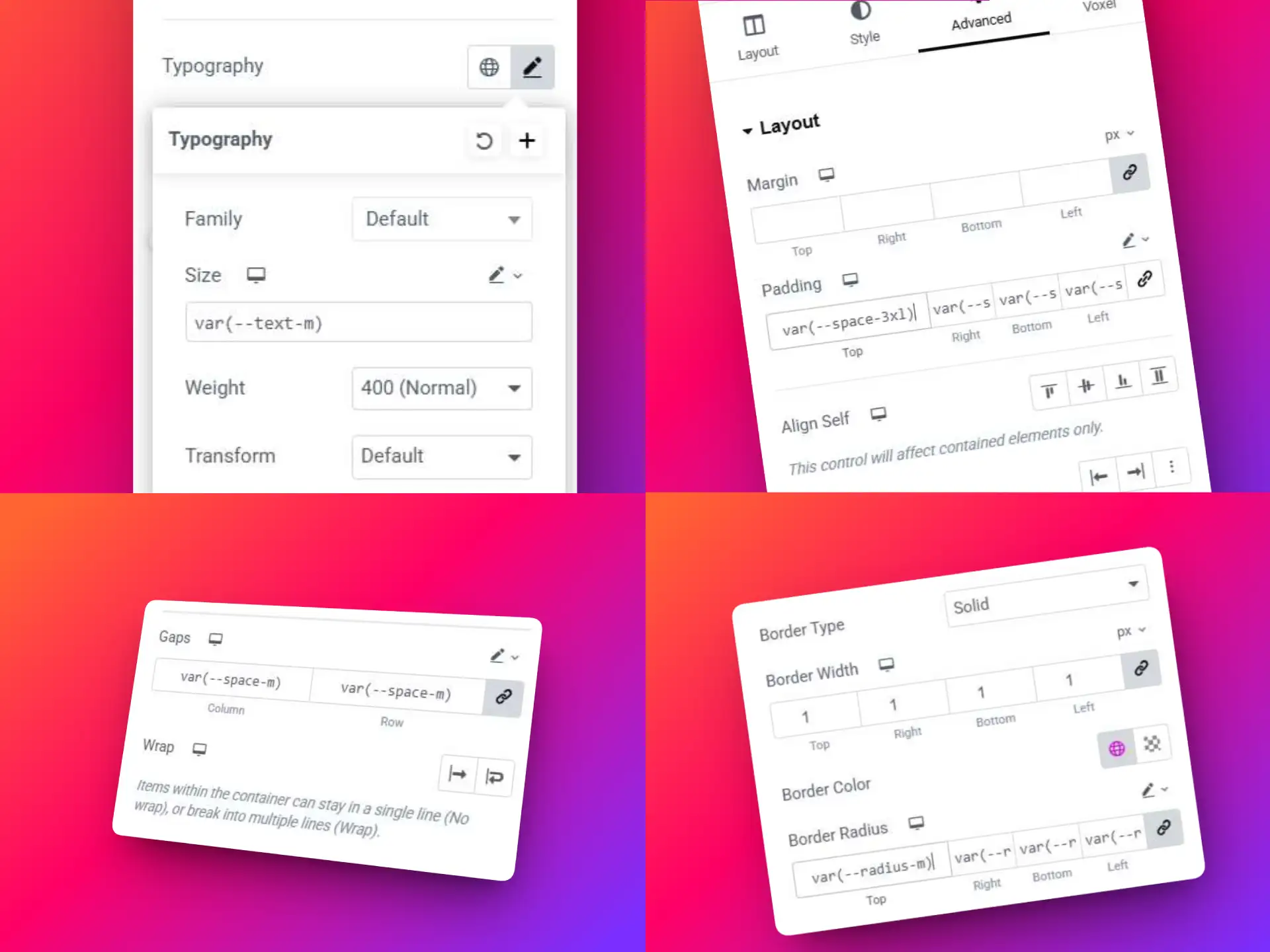
Once the variables are created, the only learning curve left is adding them into Elementor. Instead of manually adjusting sizes at each breakpoint, you simply reference your variables on the desktop breakpoint:
var(--text-l) for large text
var(--space-xl) for padding and margins
This approach keeps your workflow consistent, reduces repetitive tasks, and ensures your typography and spacing scale fluidly across all devices. You can also create variables for other elements, such as var(--radius) for border-radius, so global adjustments are easy.
With Voxel’s design flexibility, the possibilities are endless. Get Voxel here!
The Biggest Benefits: Set It Once, Work Everywhere
Fluid typography and spacing give you major workflow and design advantages:
Set Once, Forever You define font sizes and spacing once (at the desktop breakpoint). They automatically scale across all devices — mobile, tablet, and desktop — without needing separate adjustments.
Consistent Design Using shared CSS variables ensures every heading, paragraph, and section follows the same scale. Spacing and proportions stay consistent site-wide.
Easy Global Adjustments Want to tweak your typography or spacing? Update a single variable, and the change propagates across the entire site. No hunting through individual elements or breakpoints.
Time-Saving and Error-Reducing Fewer manual adjustments and fewer media queries mean less risk of inconsistencies, layout bugs, or forgotten overrides.
Better Collaboration Designers, developers, and editors all work from the same system, improving workflow and reducing miscommunication.
In short: you set it once, and your site just works everywhere.
Where to Start
Add the CSS variables
The easiest way to start is using a tool like Core Framework or Fluid Type Scale Calculator, which helps you generate fluid typography and spacing variables automatically.
Alternatively, you can manually add the CSS variables into your customizer or CSS tool of choice. Below is the scale I use, with heading variables mapped to font sizes. This allows you to choose a new heading size if you need in the future.
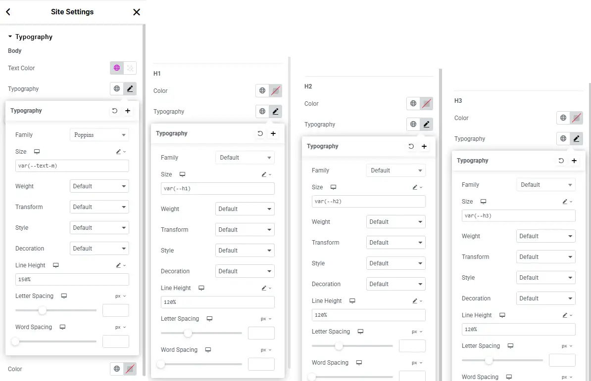
Open Elementor’s global font settings and assign your CSS variables:
Set the Body font to var(--text-m)
Set Headings H1–H6 to their corresponding variables (var(--h1), var(--h2), etc.)
Finer adjustments
Lastly, when you need text or spacing that differs from the global settings, you edit the widget in Elementor and change the input controls from px to custom, then add in the variable you want to use.
Final Notes
Fluid typography and spacing work best when planned from the start.
Adding them at the end of a project can be difficult. Any manually set font sizes or spacing values need to be removed first, otherwise they override the fluid system.
Once implemented, however, you gain a scalable maintainable design system that’s consistent, easy to update globally, and looks polished on any device.
Displaying parent categories with their child categories grouped underneath in Voxel is difficult and not directly supported by default term feed options. To achieve this, you need to use a term loop workaround that allows child terms to be looped inside a parent term preview. The steps below show how to do this using native […]
Voxel Framework is a new WordPress plugin in development that brings Voxel’s features to Bricks Builder and Gutenberg. While Voxel can create custom post types, taxonomies, and custom fields — and supports powerful dynamic data, conditional logic, and visibility rules — its real value goes far beyond content structure. Details below are speculative based on […]
